
Design for america project
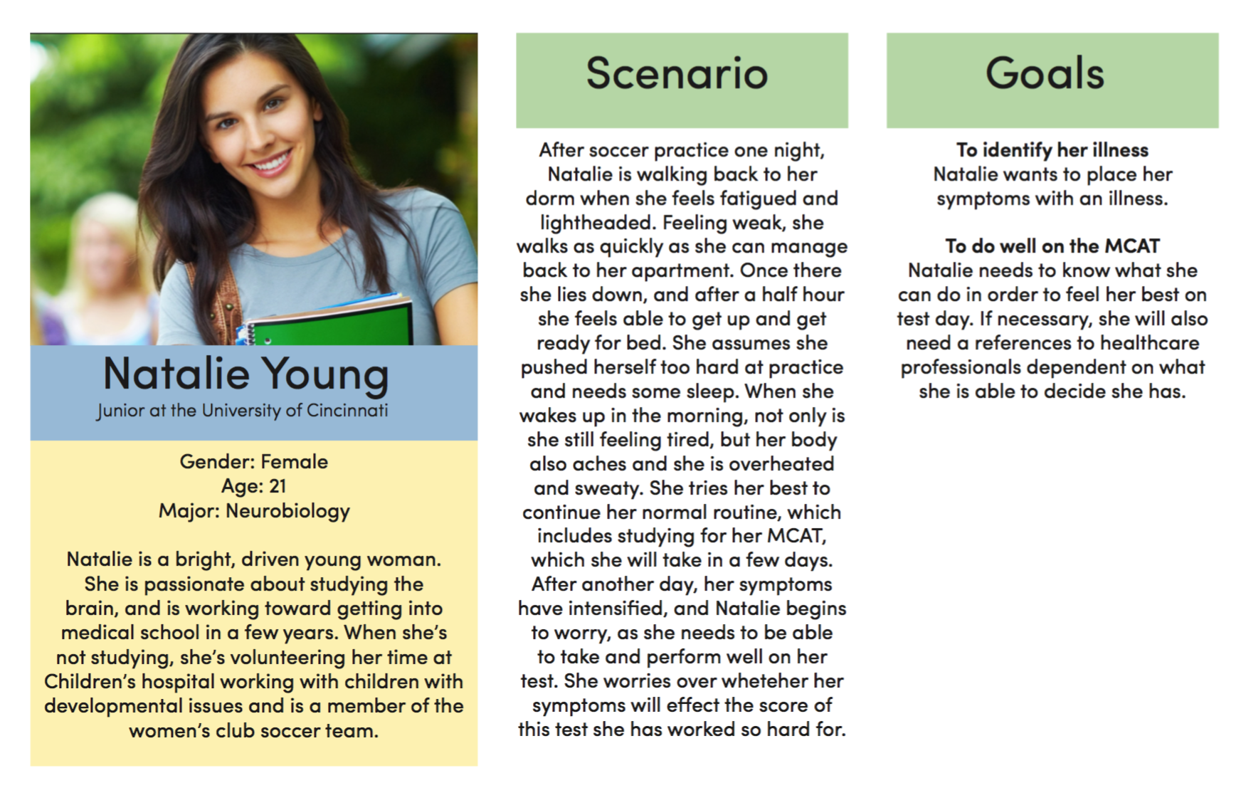
For this project, my section of the club Design For America was challenged with rebranding and app design for a Cincinnati startup called "Healthcast". Healthcast as a company creates algorithms and applies them to health information in order to pinpoint common illnesses geographically. For example, if you searched the city you would see how many people reported having illnesses such as colds, flus, and fevers in the different neighborhoods. They also have information that allows a user to enter their symptoms and for a doctor backed best guess at your illness to appear. They wanted us to design a way for people to access this information, to create ways for these users to interact with each other in groups and communities, and to give them access to global health information. This was a highly collaborative project between four other undergraduate group members and the startup company Healthcast, with them trusting us with all the design decisions.
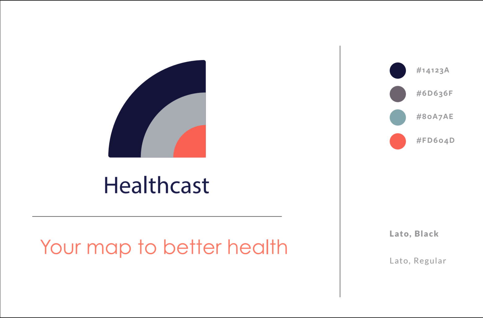
The original Logo
Brand: Healthcast (a local startup)
Objective: To represent what Healthcast is as a company
Strategy:
Who: primarily college students, those who are exposed to lots of illnesses with limited access to reliable health and wellness advice
Brand Character: “Dr. Mom”, a reliable source of health and wellness advice with a personal and comforting touch.
Brand Building Blocks: Uses a unique algorithm to compile government data and user input to give a suggested diagnosis and recommend treatments.
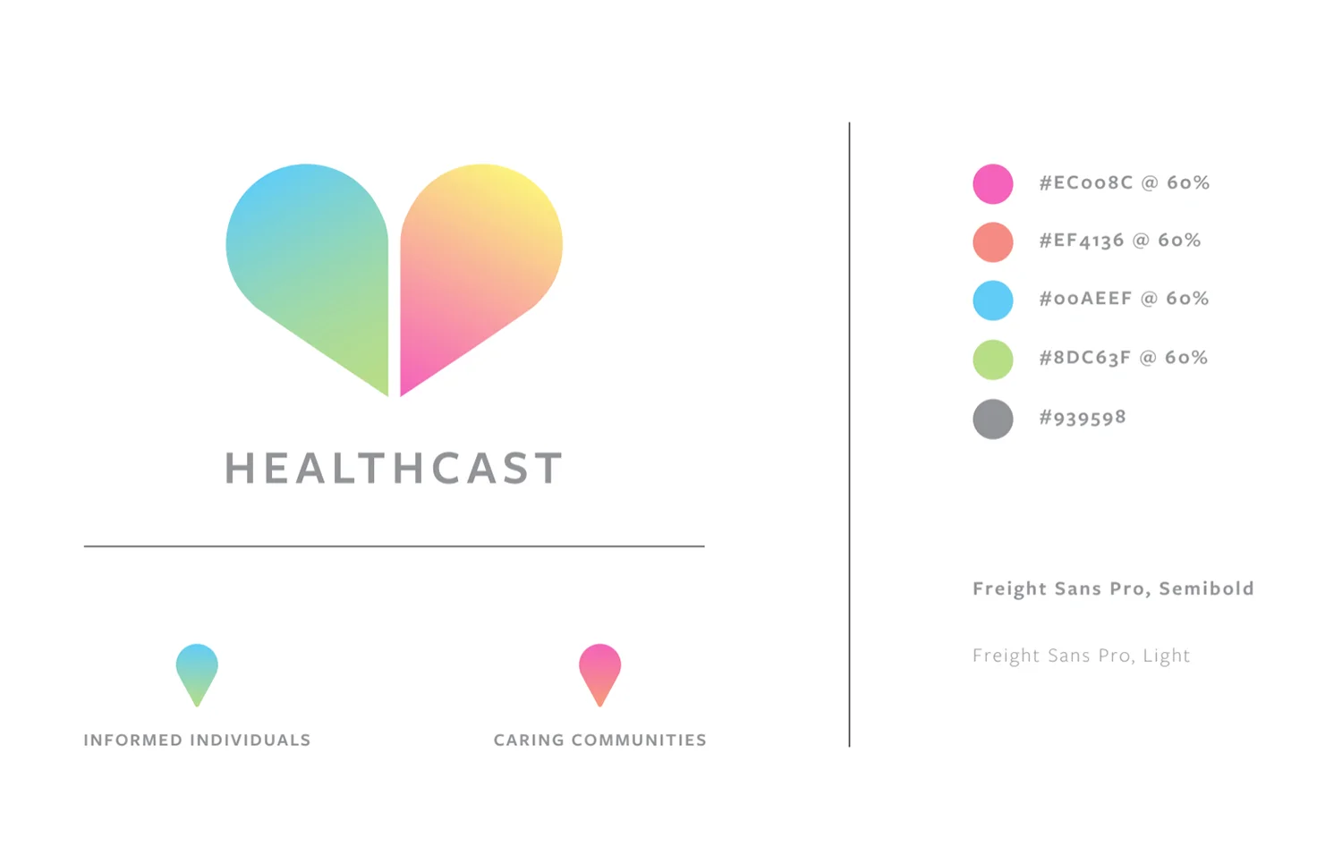
The new logo
Delivery Method: App
Design Considerations: The prime prospect is busy, and balancing school, work, and various activities. They cannot be slowed down by illnesses or the struggle of trying to schedule a doctors appointment with campus services. When they are using the app we wanted them to feel like they were being accurately diagnosed, but in a way that connects them to community and lets them feel comforted and supported. So to create this, we took the two main aspects of the company, “informed individuals” and “caring communities” and represented them with map pins put together to form a heart. We chose colors that were bright and happy to try to convey the feeling of warmth and support we were going for.
Fun Fact: this portion was based off of Twitter, but in a much more controlled and useful setting.
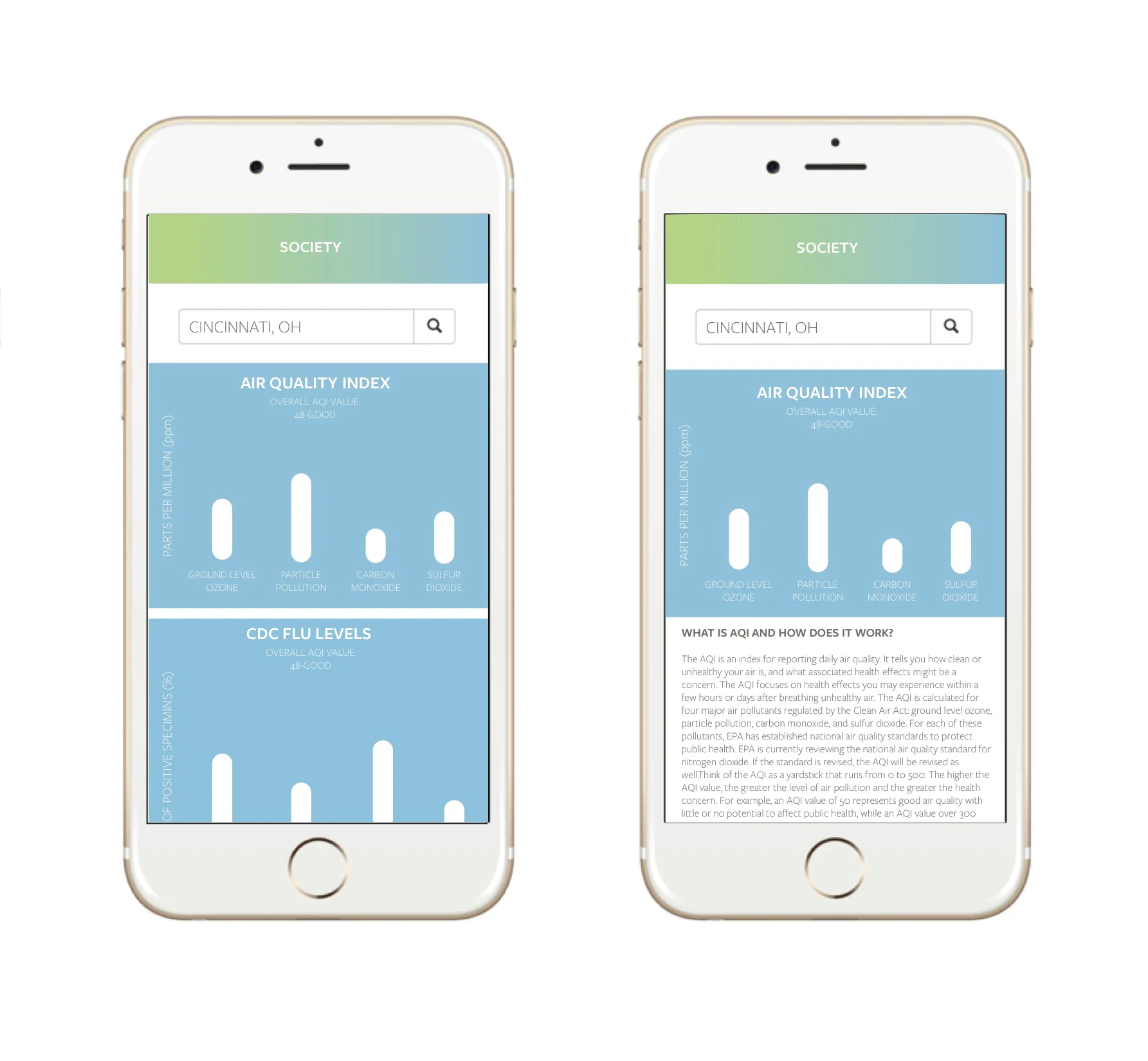
Government Data graphs
The simple format that I chose allows users to search their city, use the bar graph to interpret data, and tap on the data that they wish to learn more about and how it can be affecting their health.
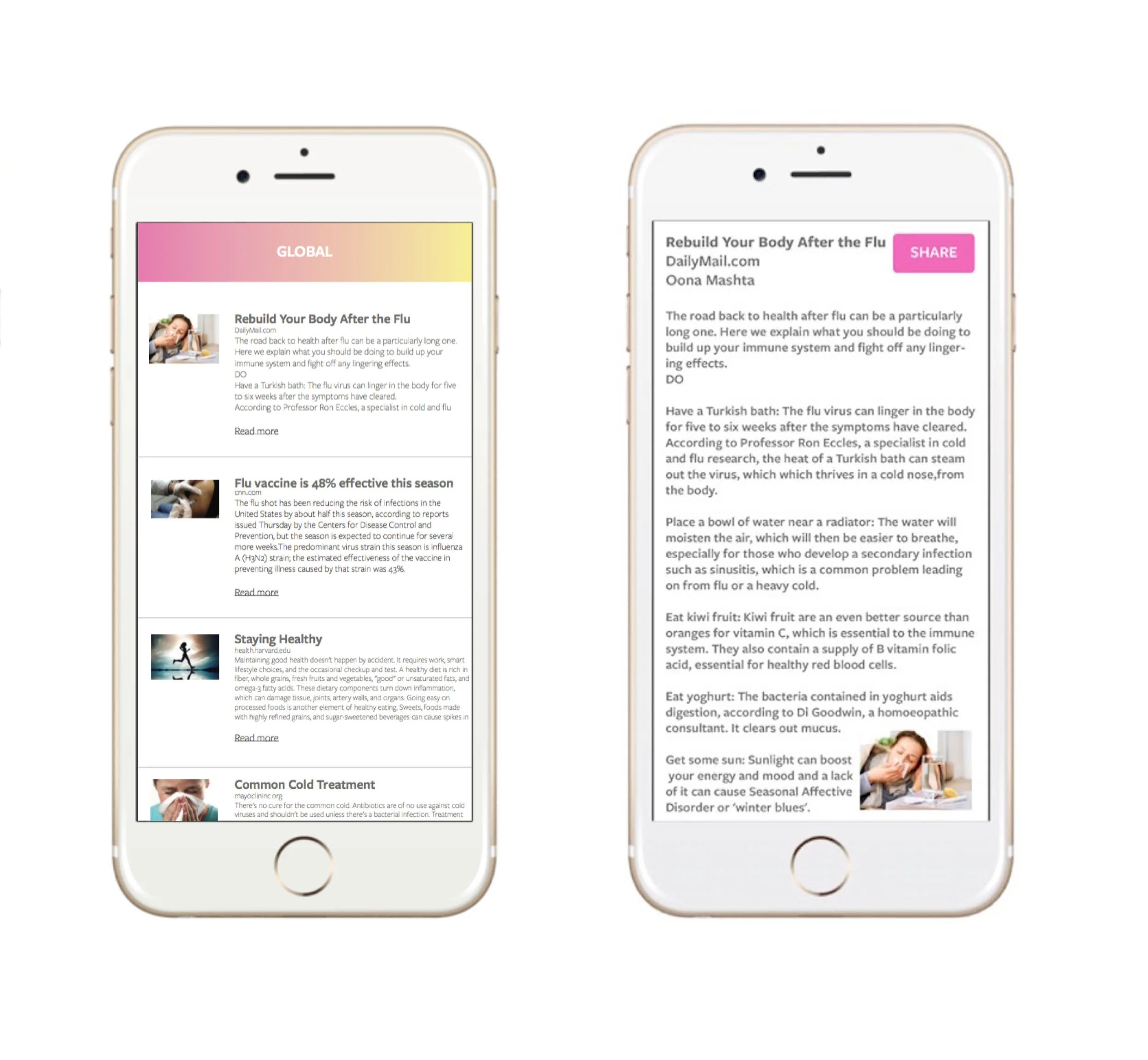
health and wellness article feed
This serves the purpose of giving users access to as much information as possible, giving easy access to knowledge of how to prevent and recover from illnesses.