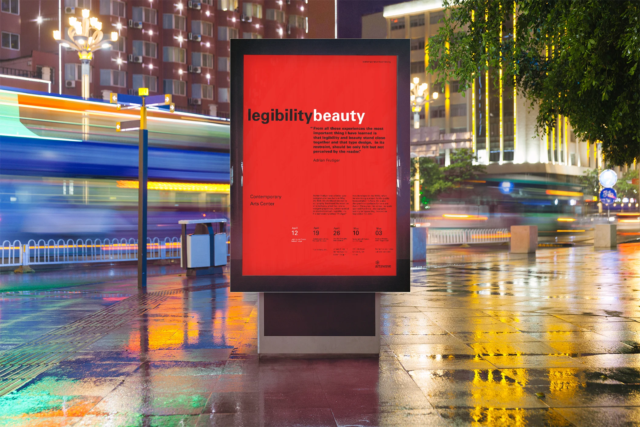
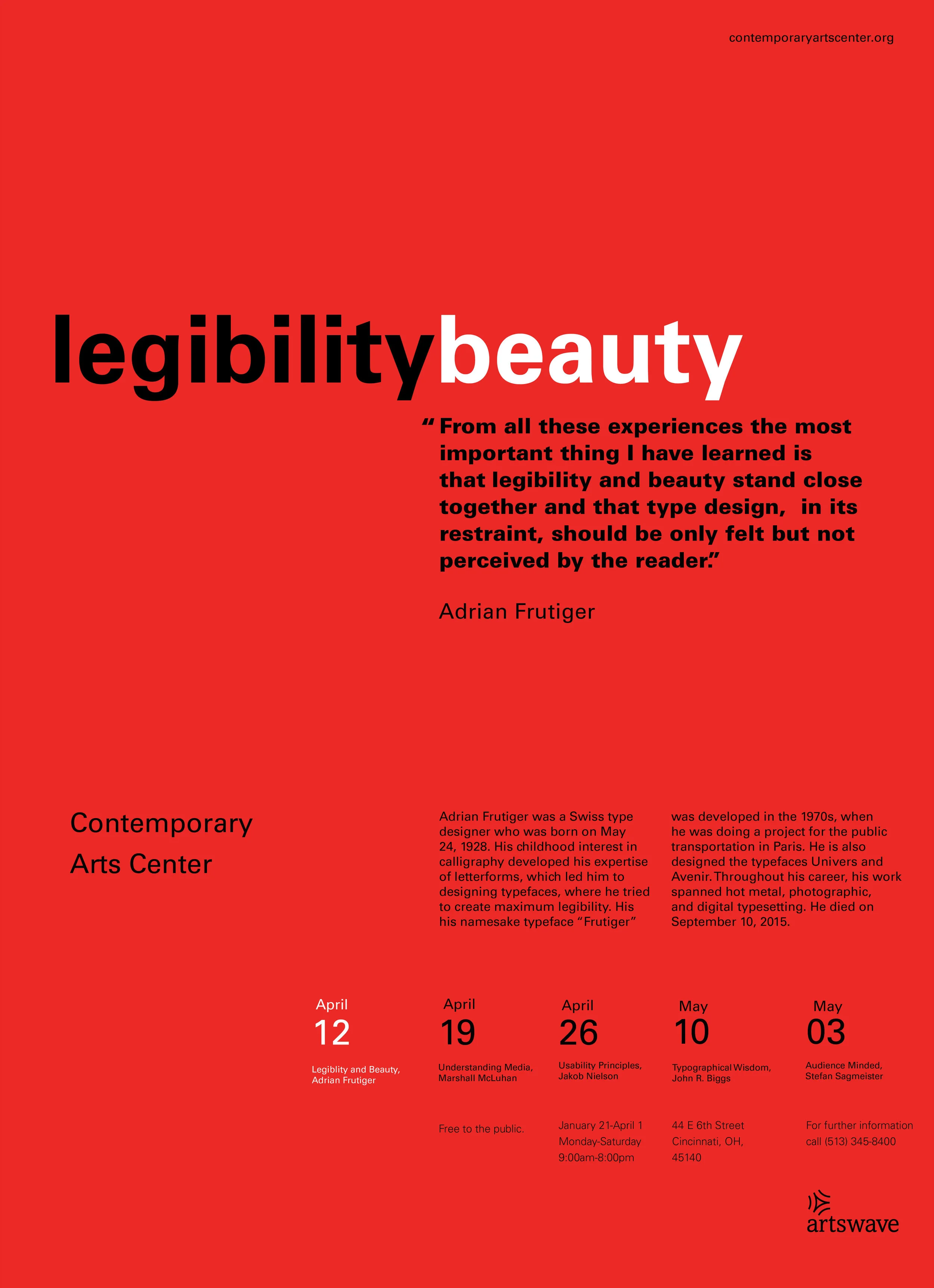
Brand: Contemporary Art Center
Objective: To promote an event series at the Contemporary Art center by highlighting different typographers.
Strategy:
Brand Character: Community centered, inclusive, celebrates art, design, and culture.
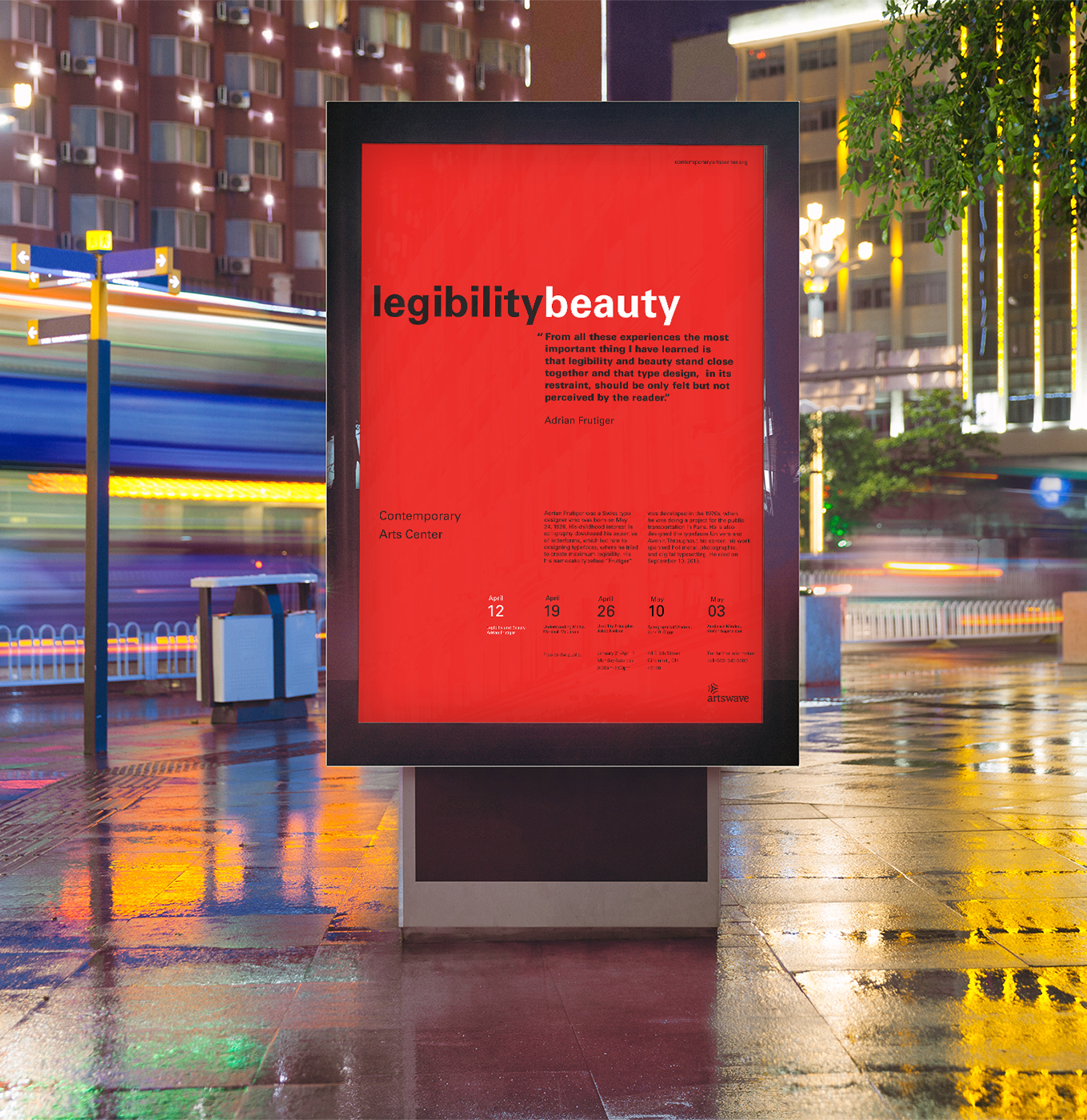
Delivery method: Poster displayed in public areas
Design Considerations: The prime prospect is the busy everyday citizens of the Cincinnati area. They bustle from work to home, and unless they are frequent patrons of the CAC, probably don’t take a lot of time to themselves. To entice them to come to this exhibition I created a bold and bright piece that conveyed the meaning of the quote, and a little about Frutiger himself through the typeface selection and the clean layout of information.
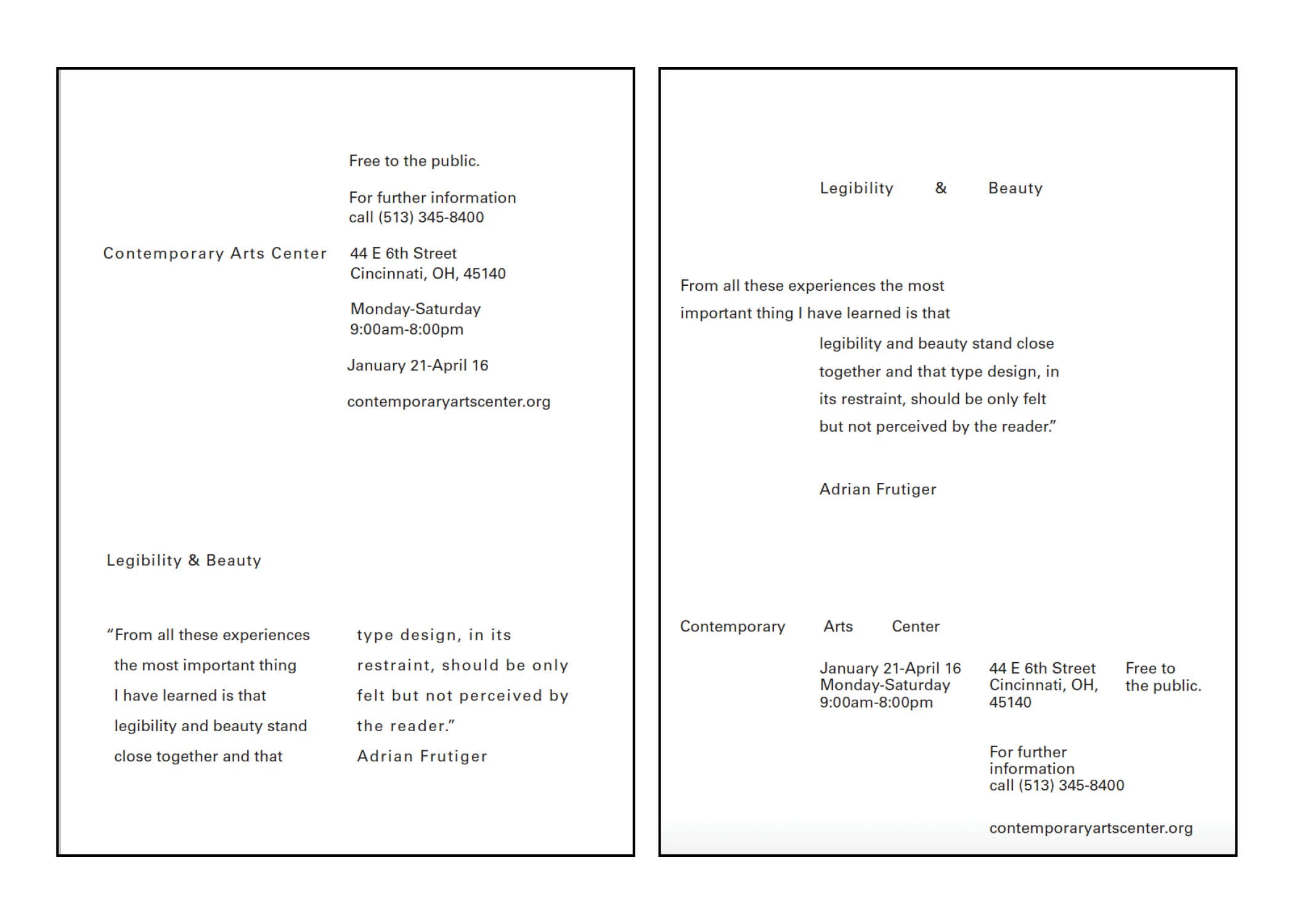
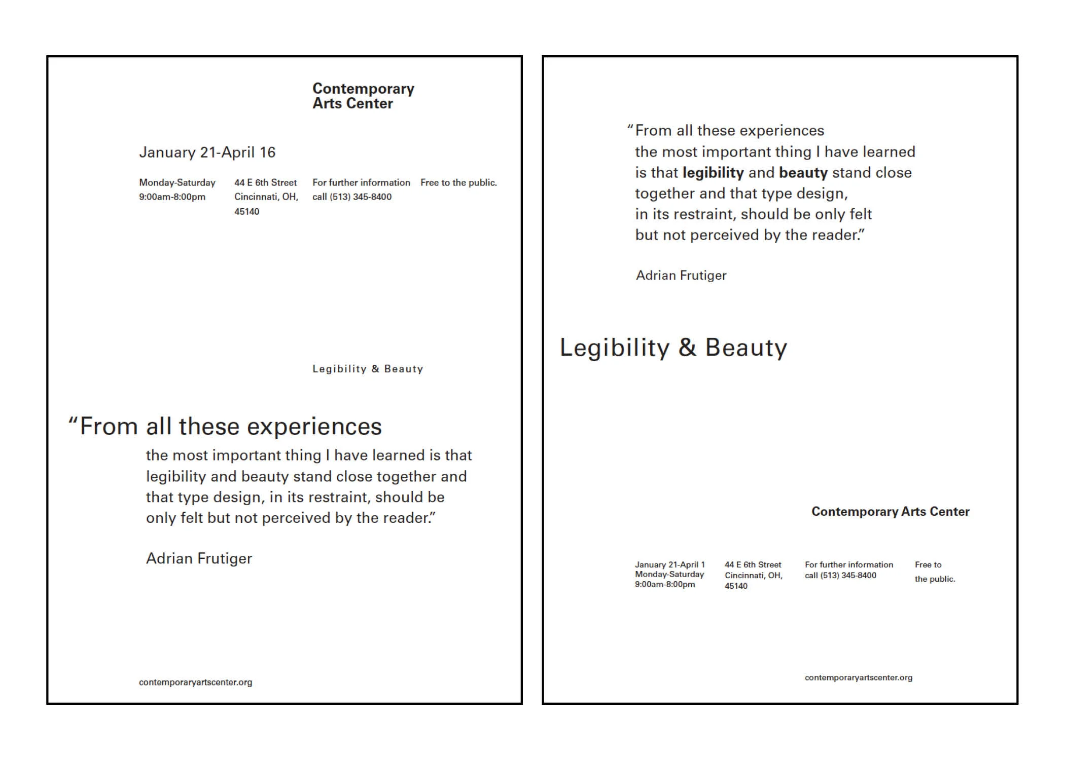
process 1: one typeweight and Typesize
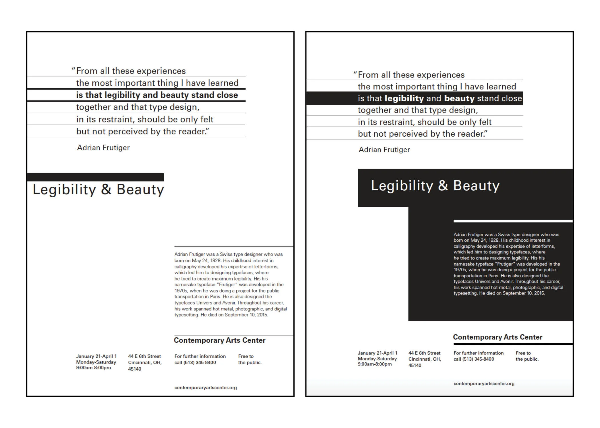
Process 2: Variation in typeweight and typesize
Process 3 : Point, line and Shape
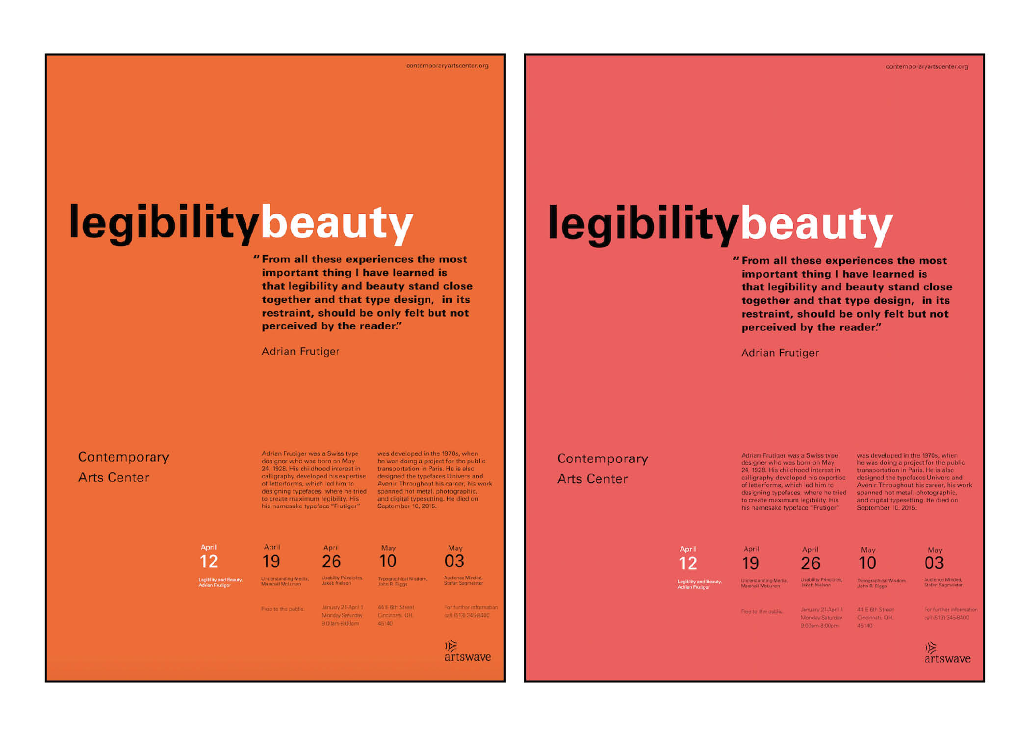
color variations