Background: Olay’s sales teams were hearing from our customers that out primary images had a problem: consumers were not able to find their products, especially on mobile. In testing we learned an even more staggering statistic, over 70% of consumers tested made purchasing decisions on the search page, with fewer than 15% even scrolling though our carefully crafted PDP pages.
Objective: Create a winning design strategy for mobile optimized, primary images. Distill into principles and processes to be replicated across the entire Olay portfolio.
Strategy: Visually, we had a stopping power problem. But with a congested competitive market like skincare there is a plethora of inspiration, benchmarks and “best in class principles”. In order to truly differentiate and resonate with our consumers we had to go back to the core of Olay and not constantly change to try to meet
Impact: From first in company in Amazon UI context AYTM test.

Process:
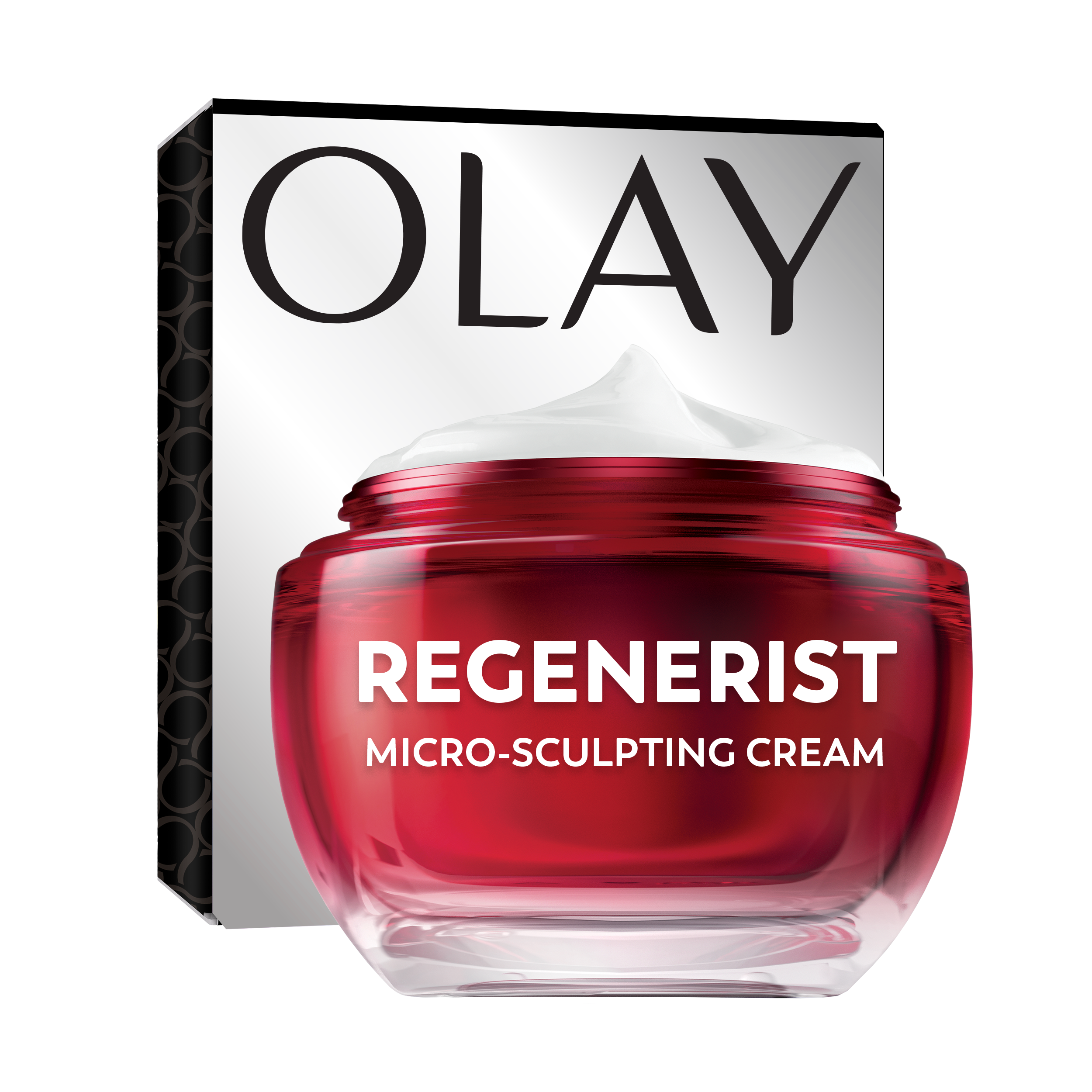
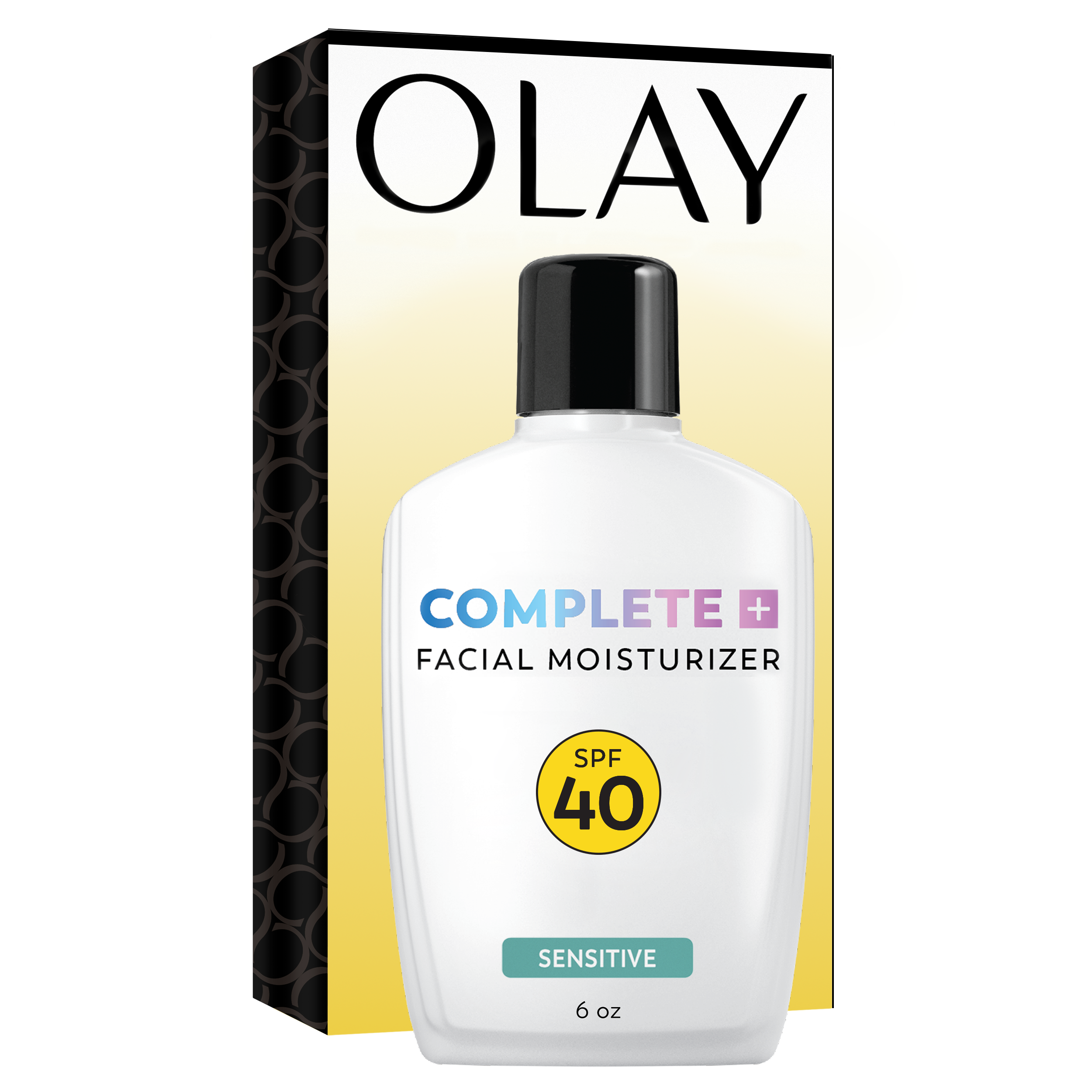
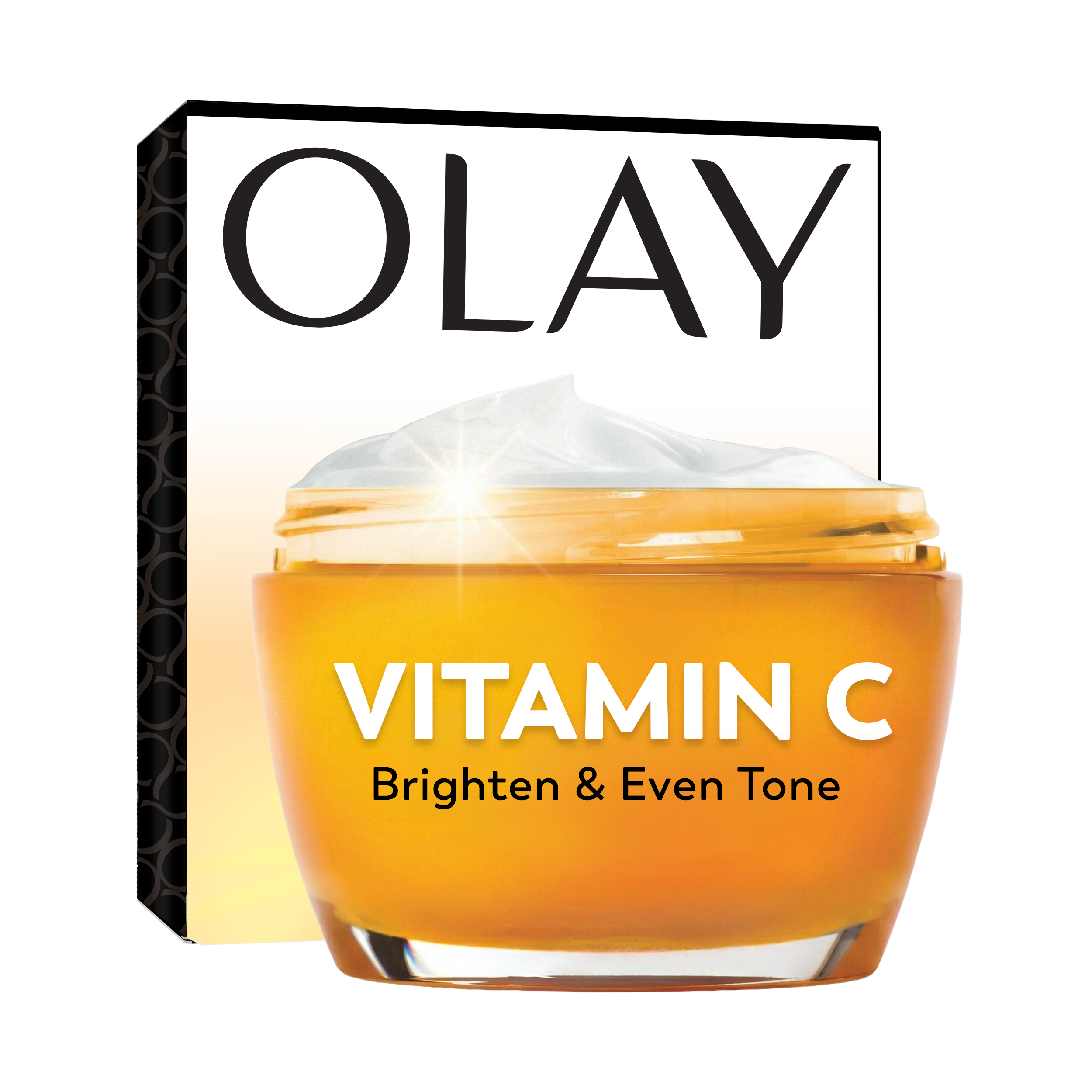
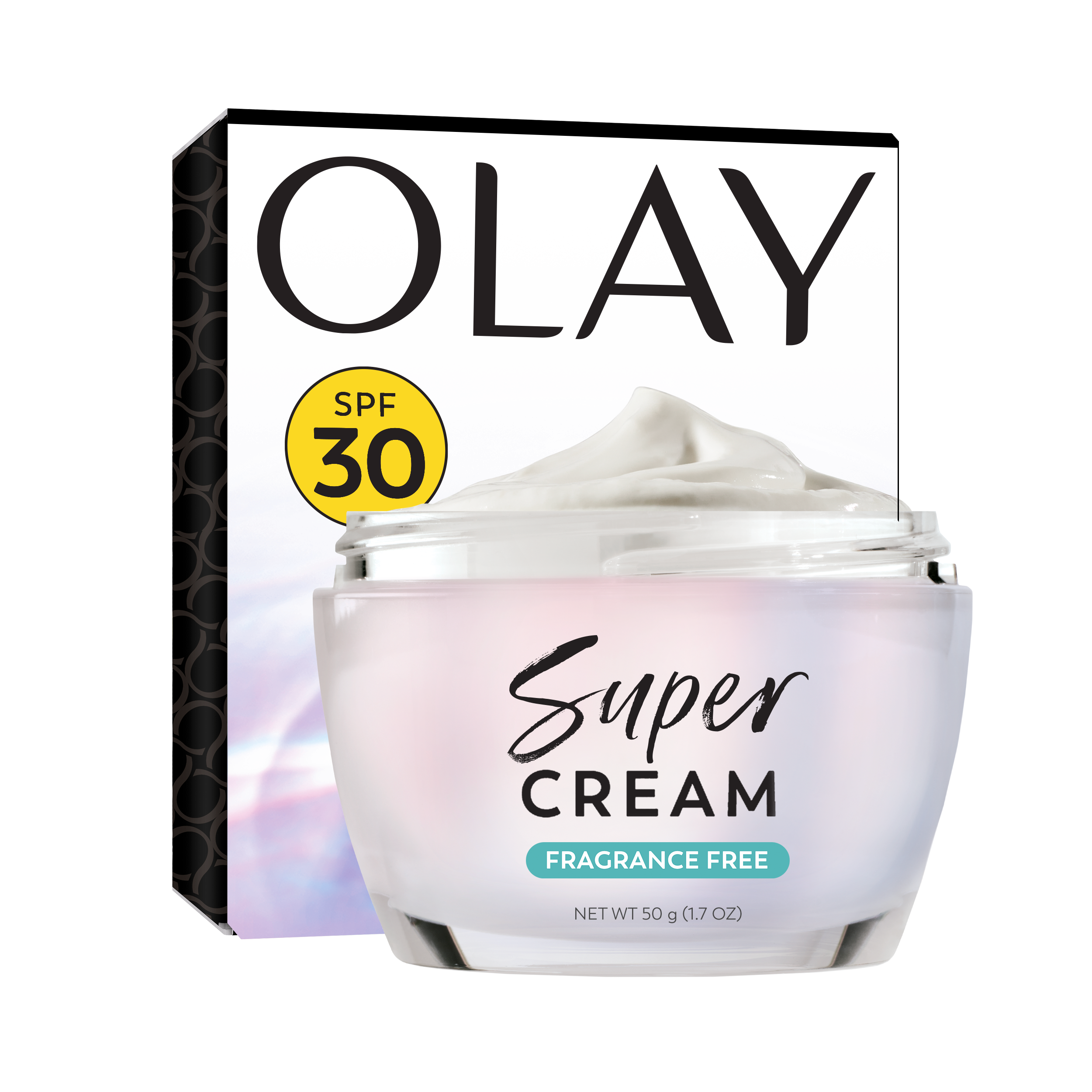
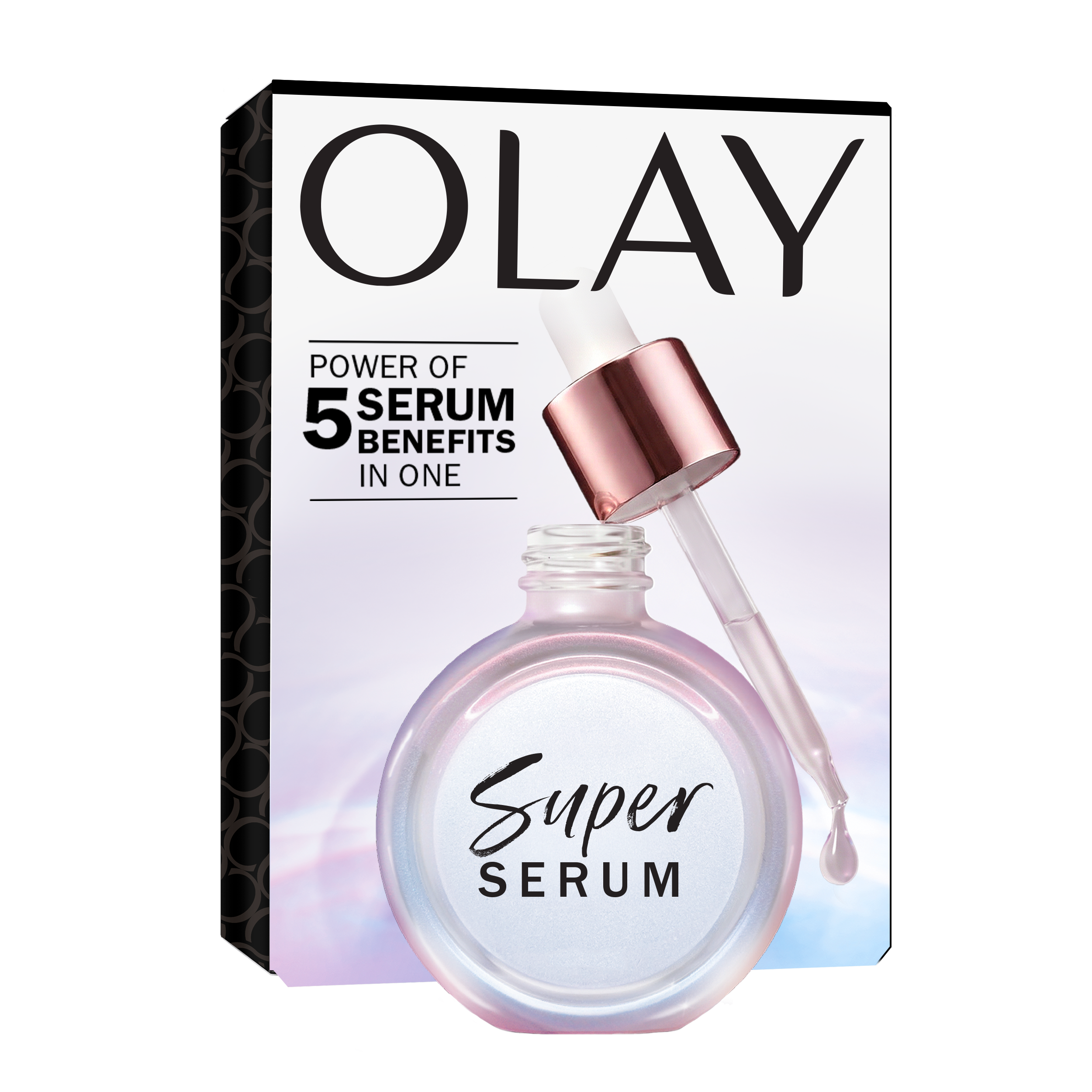
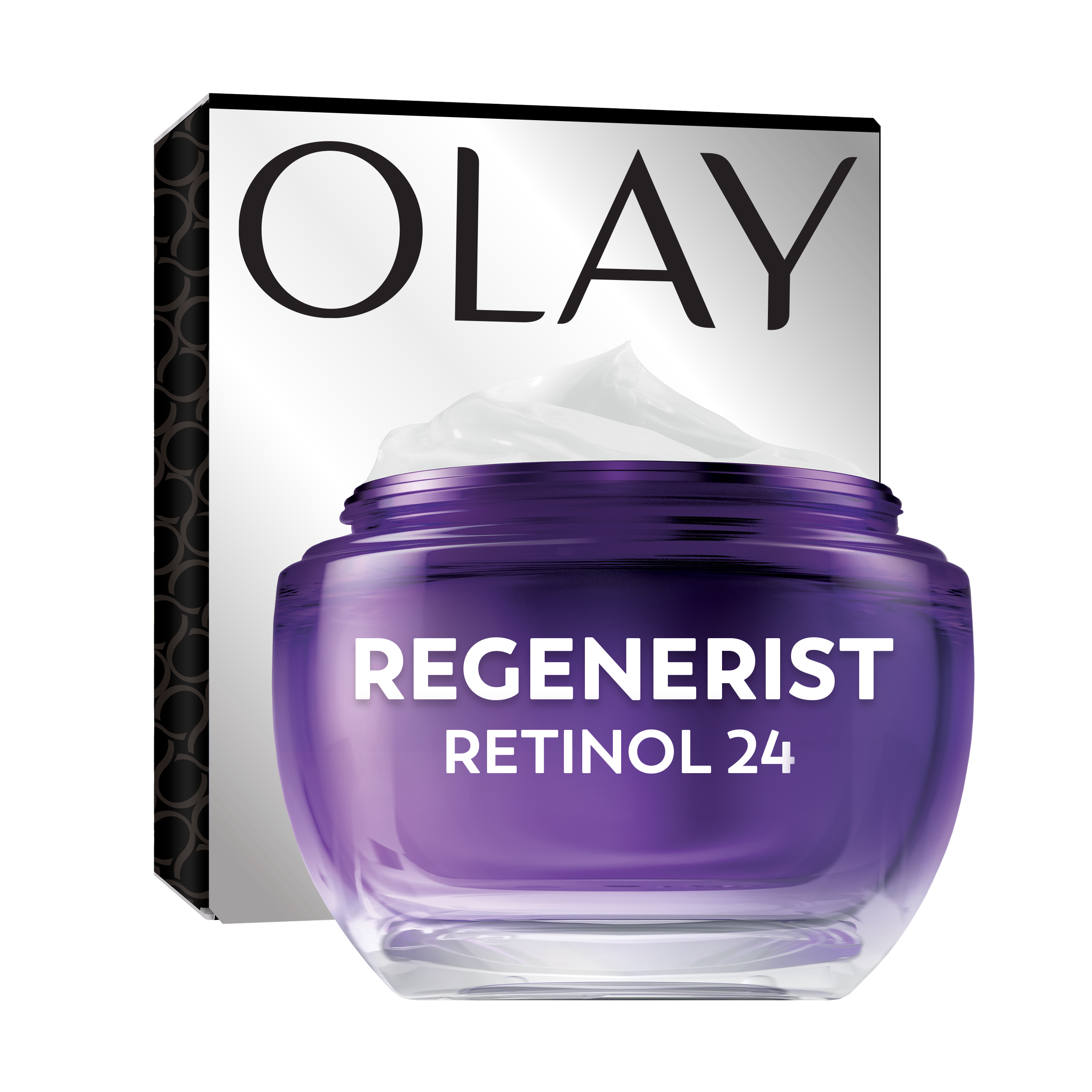
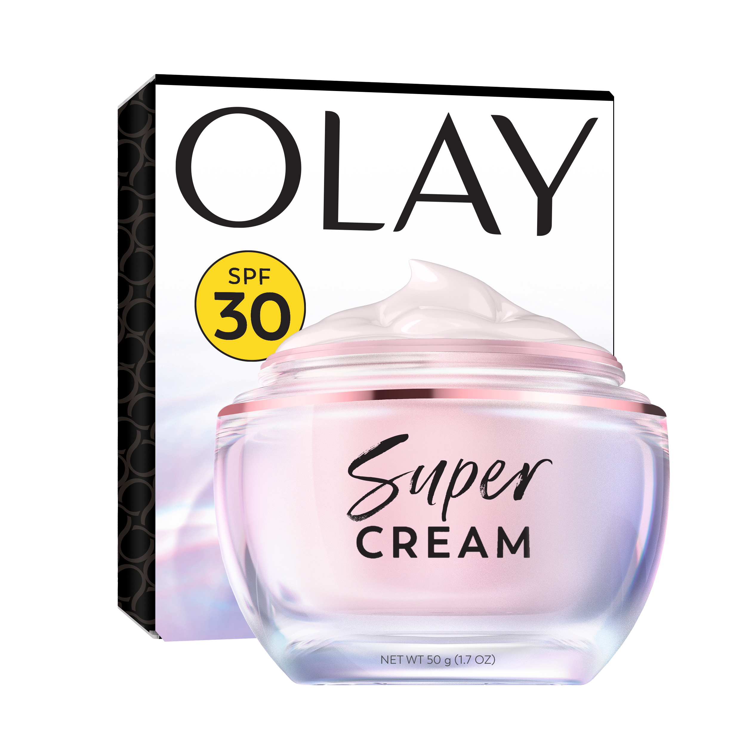
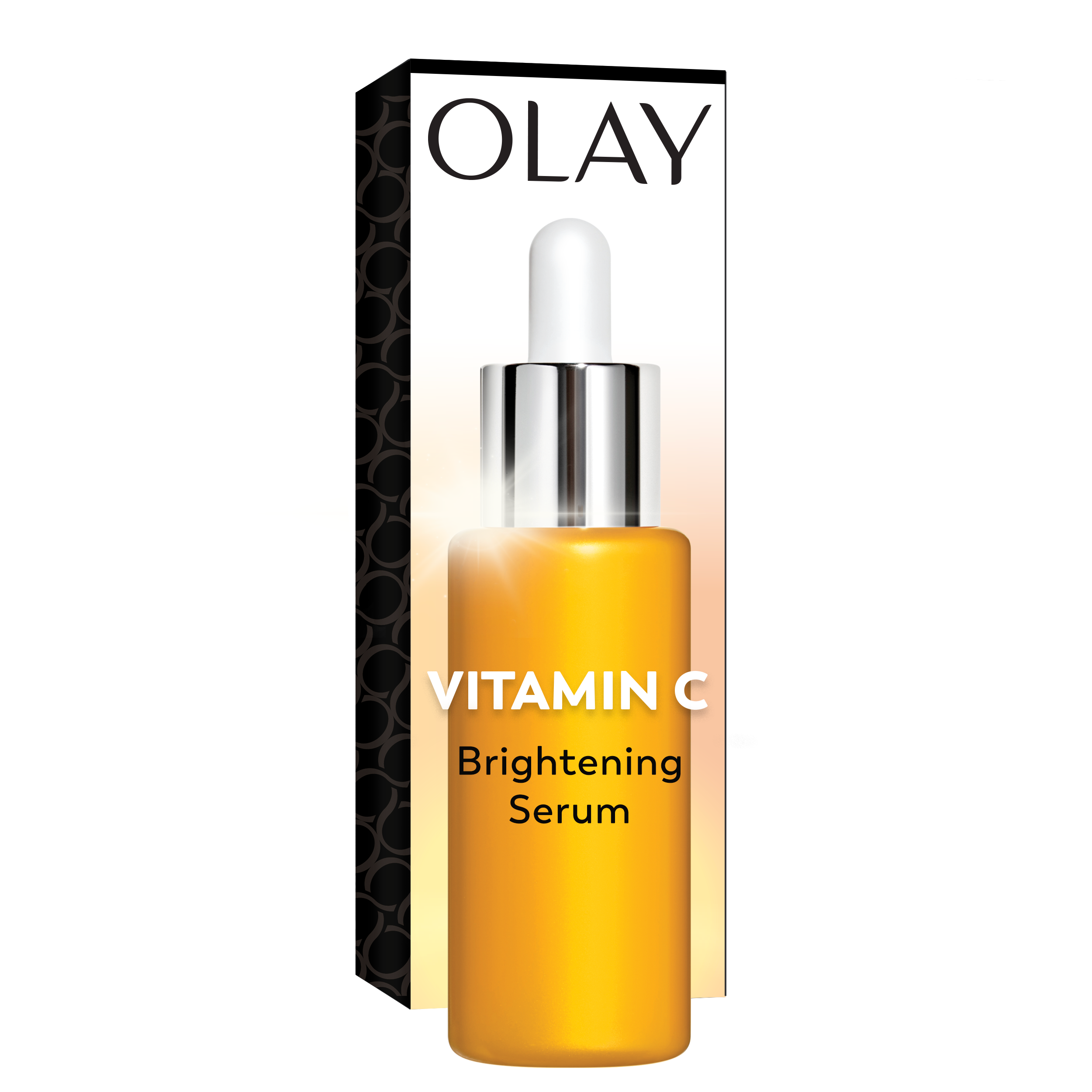
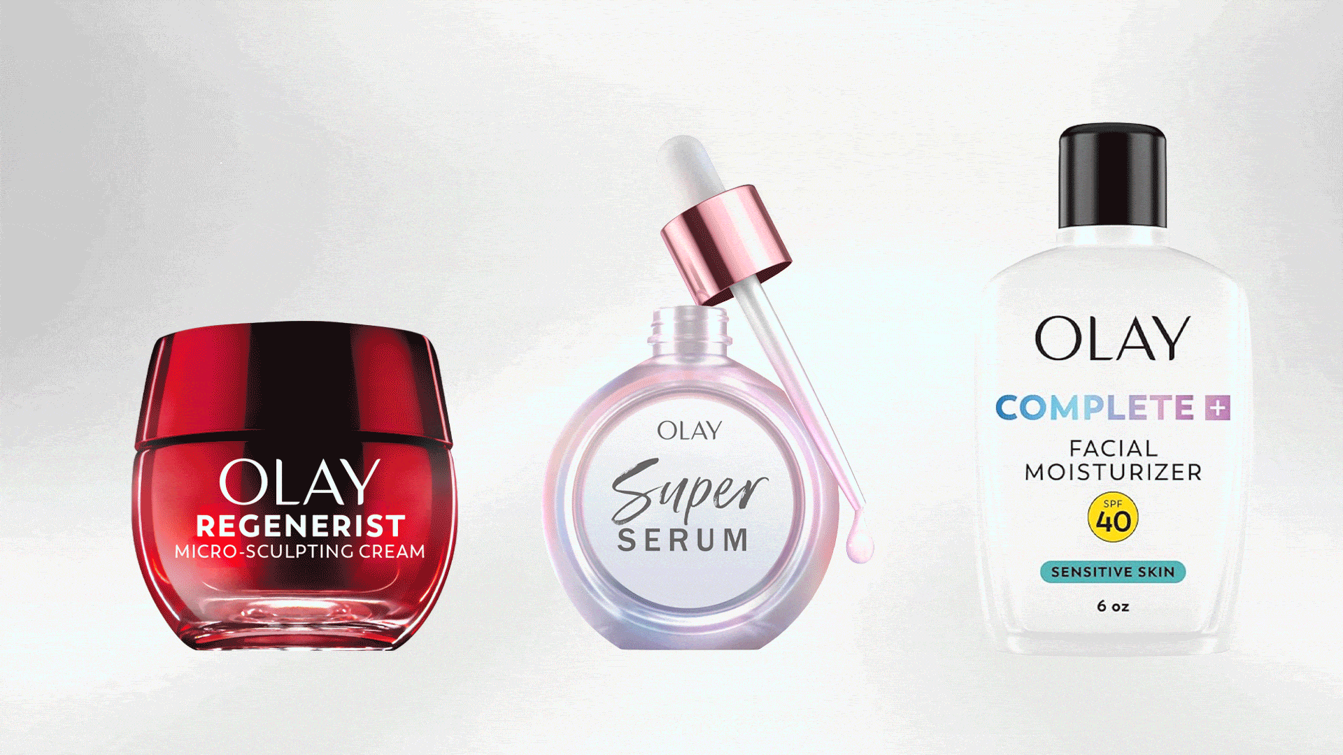
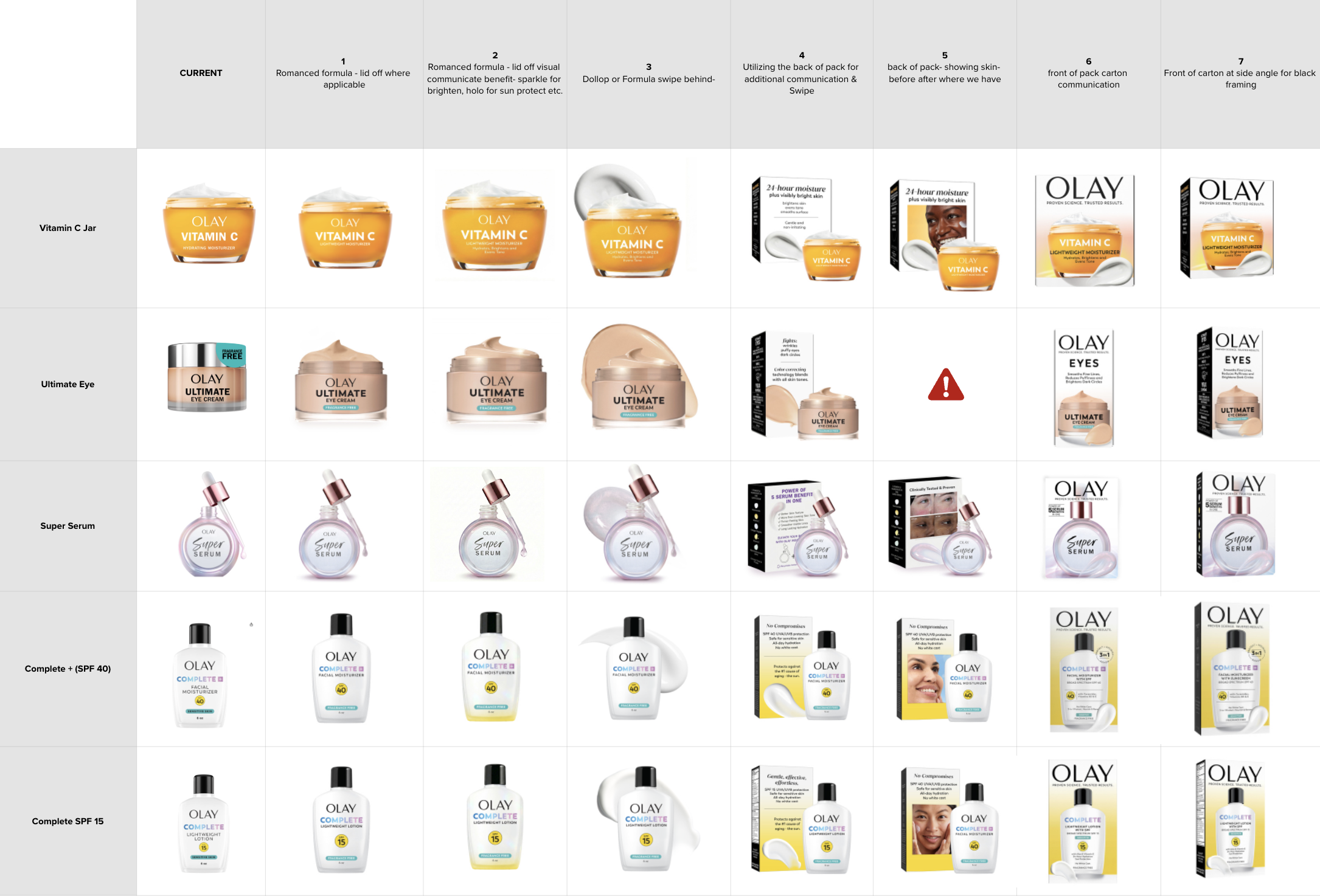
To begin the process, I explored how our competitive brands format and structure their primary images. Using this audit and shopper psychology principles, I explored a wide variety of potential solutions, using generative AI where needed to beautify the pack and modify the renders.
By coordinating a group workshop with sales, marketing and design, we analyzed the stimuli to narrow down to our top 3 options to test in context using AYTM’s new eContent analysis tool.
First round of mobile optimized images released to the market, with the rest of the portfolio coming in batches throughout 2026.